Tuesday, 29 December 2009

David Mack...


David Mack is a comic book illustrator. The images in his graphic novel, Kabuki, have influenced my own image making, and have inspired me to create a graphic novel of my own or create graphic outcomes which tell a story. I particularly like Mack's use of watercolour and photography, as well as the colours he uses. I think what makes Mack's work particularly effective is his layouts, which make the images tell the story in an interesting and unconventional way and really help each image to connect with each word.
I am also particularly influenced by Mack's use of repetition of a certain image of shape, the way he repeats a shape or image and develops it slowly into something else so that it morphs into something new and links other images together.

Wednesday, 23 December 2009

Dave Mckean...

Dave Mckean is a photographer, comic book artist, graphic designer, and filmmaker.
His mixed media work incorporates drawing, painting, photography, collage, found objects, digital art and sculpture. I take inspiration from Mckean's work because of how he incorporates so many things in his images, his work is busy and beautiful. He can also create a huge amount of atmosphere in a single image, making them perfect for story-telling. His work evokes eeriness and is strange and sometimes even scary but is at the same time very beautiful. His images seem to be made of many,spliced up and layered to make one perfect graphic outcome. I am also influenced by the colour palette Mckean uses in many of his images,from palettes of mainly sepia tones to images with rich,bright colour.

I think Mckean's use of photography and repeated images is particularly effective here.


I like the sepia colour palette and the accidental mark making in this image.


I think Mckean's use of scratchy,sketchy line drawing makes this image particularly effective.


I like the layering of photography and the many different elements in this image.

Thursday, 10 December 2009

Chemistry book...


I have draw and collaged inside and altered an old chemistry book. Around these drawings etc. I have begun to write a story involving the reincarnated carcass of my decorated chicken. I would like to try and create a graphic novel, possibly using this story. The drawings in the pages of the chemistry book are just rough sketches and doodles but I think when combined with other images,photographs etc,they might make a good graphic outcome.

Saturday, 5 December 2009

Decorated Chicken...


When decorating the raw chicken, I decided primarily to use brightly coloured jewels as I thought these would produce a garish and tacky-looking effect and evoke ideas of false luxury and bright, distasteful disguises like the wrappers on sweets etc. I created a pattern of jewels on the back of the chicken first, starting in the middle with a flower shape as the centre-piece. I picked the flower shape because it reminded me of chintzy fabrics and tacky curtain designs-patterns designed to make something cheap look attractive,most of the time unsuccessfully.


I also used feathers in a deep magenta colour which reminded me of fancy dress costumes and feather boas, bringing the idea of disguise to the forefront. I felt that placing the feathers symmetrically on either side of the chicken made it look like it was dressed in some gaudy and extravagant ensemble, and thought they contrasted well with the plucked skin of the chicken itself. The magenta colour of the feathers clashed with the pale pink of the skin.

Finally I embroidered directly onto the back of the chicken. I thought this drew a contrast, between the traditional purpose of embroidery-to beautify an object,and the repulsiveness of the fact that this object was a raw, dead animal. I would have liked to include further embroidery, but it proved difficult to achieve good result when embroidering directly onto the chicken's skin,which was slippery and wet and moved out of place easily.


I thought it was fitting for my themes that I should have to overcome my repulsions about touching the raw meat,in order to decorate it.

I decided to present the chicken itself as the finished piece rather than present photographs as I thought that seeing the chicken in the flesh would produce a more disgusted and shocked reaction. I left the chicken in part of its actual packaging because I thought this would help get my ideas about food packaging across.

Saturday, 28 November 2009

Embroidery Practice...

In order to embroider the chicken I first had to teach myself to embroider. I used this video on YouTube in which embroidery artist and designer Jenny Hart demonstrates some simple stitches. http://www.youtube.com/watch?v=ExuIHDPD1dw . She demonstrates the split stitch which I found was my favourite. I practiced on felt first with very thick thread and then with thinner thread which achieved a more professional look.

This magazine cover inspired some of my designs.

Lettering was difficult and I thought it would be too
tricky to do it directly onto the chicken.
Some of my first attempts using very thick thread.

A close up of my last practice before embroidering
onto the chicken. I think this design was quite
succesful and for this I used very thin thread.


Another close up-this is my favourite bit.


The last practice.


Friday, 27 November 2009

Artist Reasearch-Francesco Vezzoli...

I have researched artists who use craft embellishments in a non-traditional way.


Francesco Vezzoli is best known for his use of needlework in portraits of celebrities which are simultaneously beautiful and disturbing. He has an obsession with high and low culture – he draws inspiration especially from cinema and advertising, themes which are not normally associated with needlework and embroidery. I took inspiration from Vezzoli's juxtaposition of traditional media and modern themes.


Portrait of Lady Gaga as Pierrot (with tears) 2009

Tuesday, 24 November 2009

Developing the idea...

I think that a raw chicken would be the best food to decorate because of its shocking nature-being a dead animal and also looking pretty disgusting. I also thought that raw chicken was quite an interesting subject and carried lots of connotations about food and animals. I thought covering a disgusting looking food specimen with embellishments which are usually used to beautify things would, in this case make a garish and disturbing visual effect. I started to explore different types of craft embellishment including jewels,buttons,beads,sequins and feathers-which I thought would have a particularly ironic effect, and used a creative methology exercise-a morphological analysis- to come up with several ideas for the types of food, decoration/embellishment and types of presentation I could use.
Morphological analysis:

Monday, 23 November 2009

The Little Artists

John Cake and Darren Neave aka The Little Artists make small reproductions of famous pieces of modern art...


'Hirst's Shark Tank'

'Dali's lobster phone (Black Suit)'

'Chapmans' Dead Guys'


'Boing, Boing! It's the Little Artists (Enebriated Emin Enraged)'
"Cake and Neave's work has been an exploration of the iconic, a trawling through recent art history in an attempt at understanding the significance of art and the culture that creates it. Playful and irreverent but created with a genuine respect, their work while accessible in it's use of material and subject matter explores the more complex issues of process, identity, authorship, branding and art's relationship to consumerism and product. Their early work under the banner of The Little Artists was an attempt to make clear the status of artist as brand and artwork as merchandise. Their use of an existing diverse range of artistic symbols and materials (Lego, Scalextric track, Smurfs, Pictionary or even Tesco's toilet rolls), is not an attempt to create something new, devoid of original meaning but to actively incorporate already defined narratives as tools in their artistic process. A key line of enquiry for them is how much the exhibition can exist beyond the confines of the gallery space. A merchandise range, colour-coded uniforms, an interactive web-site or Christmas card mail-out all stem from the same fundamental ideas as their gallery work. Their most recent move has seen the duo identify with the strategies of Martin Kippenberger, using his formidable mythology as a reflective surface to re frame the creative process and its position in contemporary culture."

I took inspiration from The Little Artists when thinking about reproducing The Last Supper because I like how the work is playful, while at the same time carrying an intelligent message.I also like their choice of unconventional materials which I think make their work more interesting and witty but equally humble and simple.

More Ideas...

Thought about carving potatoes and vegetables into different disciples but decided I didn't really like that idea and there was no way I could carve them well enough to look like real people. So I turned to a more cartoony approach but didn't think just sticking googly eyes on a couple of carrots would be that effective...

Looked again at 'The Last Snack' and how the biscuits hadn't been changed themselves just decorated to give them each a kind of personality-a little decoration could do so much. This, I thought, connected to food packaging and advertising, where food is dressed up in all sorts of ways so that we don't know what is actually in it anymore. Food is put in certain contexts in adverts so that certain foods become only suitable for men or are covered in brightly coloured foil and deemed only suitable for kids. Food is disguised so that we don't have to think about what it really is-the dead carcass of an animal or even basically some mould.

The way we present a food can totally change peoples view of it. I thought a good example of this was meat, and how different people represent meat as a something living whose life has been taken away,a symbol of cruelty, wheras others see it as something totally removed from the living animal, a simple form of sustenance, a fact of life.

Personally, I have no qualms about eating meat but don't like to be reminded that what I am eating was a living thing-or rather, is a dead body. Not because I feel sympathetic towards the animal, but because it disgusts me to think about eating a dead thing. I am repulsed by raw meat but will gladly eat a stake or roast chicken. Is this because once cooked it looks like the meat I see in pictures in adverts and on packaging? How much do the images on packaging or the colours on the packaging itself influence how I taste certain foods or which foods I am willing to eat? Why does food need to be so disguised? Why does what an animal looks like affect my decision whether to eat it or not so much?

In order to discourage people from eating meat, meat is often represented by the discouragers as originating in some young,harmless furry creature with big eyes whom we have slayed without mercy. But why should eating a puppy be any different from eating a cow?

In these ways the packaging and representation of food plays a huge part in our perception of it.

I thought about trying to incorporate this theme into my last supper idea but thought this would be too much and decided to abandon the last supper idea in favour of this food packaging one, which I thought was simpler but more evocative. I decided that the best way to illustrate this idea would be to actually use food in the outcome, which would be 3D. I wanted to decorate food, to turn it into something different from how it is usually presented and exaggerate the idea of food being disguised.

The Last Supper...

Thinking about food and religion together brought to my mind the idea of The Last Supper image by da Vinci but made from food. However, I was pretty sure that someone else had probably already had this idea so I looked around for one and found this one made from biscuits by photographer Tom Altany.
'The Last Snack'

I like this image because it's amusing and cute but also accurate as it mirrors the positions and actions of the disciples at the table really closely. I thought about doing something similar involving vegetables or something...


'The Last Supper' Leonardo da Vinci.


As an iconic image, The Last Supper has been repeated, recreated and changed to represent the ideas, parodies and messages of many people. I had a look at some of the ways it had been used to get some ideas...


Sopranos Last Supper-Photographer Annie Leibowitz 1999
Scene from The Simpsons echoing The Last Supper
with Homer as the Christ figure.
Lego Last Supper
Animal Protection advert carrying the slogan:
“One of you betrays us 150,000 times every year.”
Scene from the film Watchmen imitating The Last Supper.
Last Supper copy done on an Etchasketch by Kevin E. Davis.
David LaChapelle's Last Supper-from his 'Jesus is my homeboy'
series used as an illustration in I-D magazine in 2003.

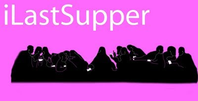
Last Supper mimicking the famous Ipod ads.

Action Figure Last Supper

Images and info on last supper reproductions from http://culturepopped.blogspot.com/

Food

Started thinking about ideas related to the theme of food. Kept a food diary for a day and made a mind map of all the things I could think about to do with food...
First idea-Food and religion-the traditional foods associated with different faiths. OR which I think is better-miracle food-the food people discover that in some way shape or form resembles a religious figure. I found looking at this really amusing and thought some quite funny work could come out of this idea. Thought about searching for miracle crisps etc. for myself but thought better option would be carving or burning food myself.
Tried carving an apple, turns out I am not a skilled carver. Thought about other ways of changing the appearance of the food so it looked like religious figures...


A Cheeto resembling Jesus dubbed "Cheesus Christ"


Jesus found hidden in a grape in the USA.


Fred Whan of Ontario keeps this special fish stick in the freezer. Cooked in 2003, Whan couldn't help but notice this particular fish stick had a distinct image burned into it. He later realized it was Jesus.

Thursday, 15 October 2009

Sweded Movie...

My group were given the film 'Edward Scissor Hands' to make a 'Sweded' version of. We decided to use puppets rather than real people for the characters which we thought would give it more of a 'homemade' feel. For puppets we used gloves decorated to look like each character. We also made sets using card, paper and paint of the house and the castle where most of the events in the film happen.


Before we could write a script, we had to decide on the most important bits of the film since we could only include a few scenes. (We were only allowed to make the video two minutes long.)


Then we wrote a script using various snippets from the real film script and some of our own improvisation : ) . We taped the soundtrack to the film so we could play it at different times during our video.


We took turns at filming and each played one or two characters. I played the part of Jim, Winona Ryder's evil boyfriend, which basically involved shouting angrily and fighting with the Edward puppet until I met my dramatic end by falling from the roof of the castle : ) .


Anthony Micheal Hall as Jim in Edward Scissor hands...
... Jim the puppet-the resemblance is uncanny...


Jim being angry.