Friday, 10 December 2010

The Walls Are Talking- exhibition.

I visited this exhibition at the Whitworth and wrote a review which is included in my journal.

Thursday, 2 December 2010

More Magnet Men...


I have now imagined that these Magnet Men have infiltrated the media, and have started using collage to place my magnet men onto magazine ads and pictures to represent this idea.


I was inspired to 'edit' magazine images in this way by this sketch onto a poster of a pin-up girl by Picasso.

'Jaime Sabartes with a Pin-up' Pablo Picasso, 1957.


I like this image (above) in particular because I think it looks as if my additions are really part of the advertisement.


Developing this process, I have created a set of three, more complex images, using drawing and collage. In these images, I wanted to depict the sinister nature of my characters, the idea of them creeping up behind you and changing you without your consent. I chose to use pictures of models from fashion magazines because I think they have a more striking effect than an ordinary photograph, and also because fashion and fashion advertising, have a way of changing and slowly transforming how people look and how people feel about themselves.


With this image, I wanted it to be about choosing the right image, so that what's happening is obvious right away. I wanted to express the feeling that wherever you turn for help, this sinister force will be there too.


In the image below, I wanted to show a magnet man merged with a human, and increase their sinister vibe by choosing a picture of a model that looked timid, with an intimidating gang of creatures just behind her, and already taking over. I chose to keep the same colour palette I used for the magnet man, as if they had already transformed their surroundings


In this image I tried to create the feel of things lurking in the shadows, without actually using much shading, as I wanted the image to be clear and simple.


I will use these images to create a final series of collage images on Photoshop, layering other drawings or material and possibly text,to make the images more complex and interesting.

Saturday, 27 November 2010

Magnet Men In the City...


I have started experimenting with the idea of the magnet men infiltrating every day life, and transforming things from our world to look like them- (their sketchy, black, brown and white style).


I have drawn things from around Manchester in the style of the magnet men in connection with this idea.


Some examples:


Parts of the big wheel in Manchester City Centre- 'transformed'

Monday, 15 November 2010

Magnet Men Continued...

I have decided on a Photoshop collage approach for this project as I think it is one of my stronger ways of working and I need to have the work done quickly so don't want to have to start again if a new technique goes wrong.


Before moving onto Photoshop I have made a series of images (sketches and collage) in my sketchbook which I will then use to create 3 final images on Photoshop.


Some pages from my sketchbook:


Tuesday, 2 November 2010

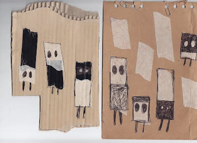
Magnet Men...


I am struggling to think of an idea for my next project, so, after being advised to in a tutorial, I have looked through my general doodles and sketches and have decided to try and develop a project around some little men that I had doodled a while ago, and which popped up a few times.


These characters remind me of the half blue, half red magnets used in science classes at school, so I have dubbed them 'Magnet Men'.


Wednesday, 27 October 2010

Hair continued...

I have also become interested in the theme of preservation, which I think connects to hair-especially in the context of mourning and mementos.


I have started to think about the themes of hair and preservation using spider diagrams and lists.


I have used my own hair to try out hair drawing, starting off with a basic flower design.


I have also created three 'deformed' wax candles using crushed coke cans as moulds, which contain hair collected from the plughole of my bath, which can be seen, preserved within the wax.


Although I like the idea of using hair and enjoyed making these tests, I don't think the outcomes were particularly interesting, and I'm not sure how to take this idea further, so I have decided to move on to a different project, and maybe come back to this idea at a later stage if I can think of a way to bring it forward.


My hair drawing and design for the hair candles:


Saturday, 23 October 2010

Hair...

At the moment I'm interested in using human hair as as a material for artwork.


The theme of hair interests me, as it's something that can define us and our appearance, that can represent different cultures, that carries our DNA, that can be seen as both disgusting and beautiful when placed into different contexts, and which can serve as a memento of a person


Physically, hair can also be interesting, with the many different options of style and colour, and different textures, lengths and smells.


Hair's fragility, how fine and breakable it is are also attractive to me. I have also always wanted a gorgeous long, thick head of hair, having thin and slow-growing hair myself, which may have something to do with my interest in it.


The Victorians used the hair of dead loved ones to create beautiful pieces of mourning jewellery- the hair was often put inside a locket but other times was woven into bracelets etc. They would also make pictures for the wall using the hair.


Looking at Victorian mourning jewellery was what inspired me to try working with hair.


Some examples:


American artist Melanie Bilenker is inspired by mourning jewellery and uses hair to draw pictures of mundane events-her work is small and usually in the form lockets, brooches,jewellery etc.


'Falling Asleep'


'Taking a Bath'


Artist Jodie Carey uses small amounts of human hair in her paper wreaths of flowers, which feel like they also fit into the theme of mourning.


Thursday, 21 October 2010

Artist research for Shelter...

Francesco Simeti


Francesco Simeti plays with interiors and brings 'outside world' issues into the home environment in his wallpaper piece, 'Acorn'. The paper juxtaposes an old fashioned ornate wallpaper design with images of men in white suits clearing toxic waste.


Ikea


This advertisement uses a bus stop filled with furniture to look like a home.


'Bus-tops'


Artists Alfie Dennen and Paula Le Dieu have been specially commissioned to create these public artworks for the Olympic games in 2012, which feature LED panels on the roofs of bus stops all over London. The artists aim to surprise and delight, get people talking, communicating and tapping into their own creativity.


Friday, 15 October 2010

Shelter-final result...

Images of the finished bus stop and the process of decorating:


I think the finished shelter looks effective, and we managed to create what we set out to, despite various obstacles along the way. However, I think the overall look could be improved as it isn't very polished-it looks like it has been stuck up at night.

The feedback we got said that we had a good audience around the stop, so we achieved the entertainment value we wanted, but that we could have presented the work better in the studio. I think some unintended ideas were picked up on by people, and some saw it as a fairly obvious concept, but although it was, it was just intended to make people smile, and allow us to explore and experiment with our environment.


I feel this would be a great project to develop and we have agreed to continue decorating different bus stops around different themes in the near future.

Wednesday, 6 October 2010

More Shelter...

Due to time constraints, we have decided to use shop bought wallpaper from a second hand shop, the floral pattern matches our theme. I have used my bird motif to decorate a lamp that will sit on the bench in the bus shelter.

We have also purchased light switches and plug sockets to add to the walls for realism and detail, as well as a table, lace for curtains and a picture to hang which depicts a bird.

Saturday, 2 October 2010

Shelter- continued...


We have decided to create our own screen printed wallpaper to hang in the bus shelter. Each of us is working on a design related to the theme of birds and their shelters-nests etc. We feel a bird motif fits in with the chintzy, vintage style of decoration we have chosen to use.

For my design, I was inspired by reading about the Bower Bird, a bird species native to Australia, in which the male constructs a small shelter or bower in order to attract a female mate. Not only do they build this structure, but they also decorate it with flowers, grass etc, placed in patterns. Sometimes they even paint the walls using a mixture of their saliva, and pigment from things like berries or coal to create a kind of paste applied with a piece of bark for a 'paintbrush'. Each bird makes a different bower and after finding a mate the shelter is not lived in but left to disrepair. It is purely for the purpose of attraction.


An example of a Bowerbird and its bower:


I feel that this idea fits in quite well with the bus shelter, as our aim is simply to attract and interest people, make the laugh or smile, the decoration isn't supposed to be practical or permanent.

I did lots of different designs before choosing the final one. I decided to use bold, black ink pen to give a modern aspect to the design and make it clearly visible as it's audience would be passers- by. However, I concentrated carefully on changing line thickness and the flow of lines to keep the fragility, fluidity and natural feel that I think of when I imagine a bird.


Some of my sketchbook work for shelter:


This is my final design for the wallpaper motif:


Emma's flyer design to promote the project:


Thursday, 30 September 2010

Shelter


I have become involved in a group project with Emma , Fiona and Kate on the theme of 'shelter'. I used a spider diagram to come up with some of the ideas I relate with the word shelter.


As a group we have decided to use Fiona's idea of decorating a bus stop to create the experience of a personal, interior space in a public, exterior one.


Saturday, 24 July 2010

Summer project- continued.


While on my bus journeys I sketched down various observations I made such as writing down fragments from conversations I overheard, copying the graffiti on the seats or drawing people's clothes and faces.


I decided to work with my sketches of fellow passengers' faces as I thought these were the strongest part of my observations.


The brief for this project specifies that the final piece should be wearable, so I have created a charm bracelet, made from embroidery thread in the three colours of the bus routes. The heads of the passengers are the charms, which I have copied onto different coloured paper for a more bright and eye catching look. I think the fragility of the bracelet works well with the idea of human relationships and helps me explore the idea of how every passer by you don't even think about, could have been, or could still be, a potentially important person in your life, a soul mate, best friend, judge at a future trial, serial killer or drunk driver who happens to kill you...the possibilities are endless. But I may also never encounter my fellow passengers again.


Although I like the fragility of the bracelet, I feel that if it was made out of metal or plastic it would look more impressive, and draw more of a juxtaposition between beautiful jewellery and intricate design, and a dirty city bus and the complete chance and unpredictability of the universe.


The drawings of passengers' faces which I later attached to a bracelet made from plaited embroidery thread.

Thursday, 8 July 2010

Summer Project-observations home and away.

During this summer, I didn't travel abroad or go on holiday in England, but I have started, to regularly use the bus route between Manchester city centre and Higher Blackley on the outskirts. I have decided to use these journeys as my new environment, and make and record my observations while on the bus.

Friday, 14 May 2010

Scale Project

The brief for this project was to explore ideas about scale in Manchester.


After thinking about several ideas, I decided to work with the concept of a view finder. Having recently done my tree house project I also decided to link it with this.


I created a viewfinder by making a mini tree house/hut model from thick card and glue and cutting out a hole opposite the window so you could see straight through it to the other side by putting your eye to the hole. I then used images of different locations in Manchester which I sourced from magazines and city guides, as slides to hold in front of the window.


The overall effect was the experience of being inside the tiny hut, looking out onto different Manchester scenes such as Market St., the Lowry and the City of Manchester Stadium.


I think this idea worked well, and I was particularly interested in some of the photographs I took through the viewfinder, so I may experiment with this idea further in the future.


Some of the photographs I took through the viewfinder:


I like them because I think they play with the idea of scale really well and like the contrast between the brightness of the scene through the window and the surrounding darkness of the hut.


Initial sketch/design for hut:


The hut model:

Wednesday, 14 April 2010

Tree Houses and Other Things...

Tree Houses.


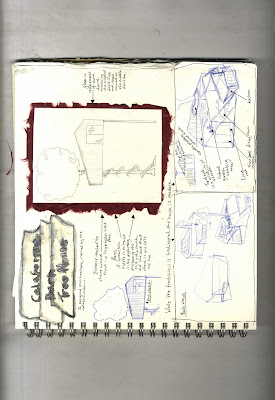
These are pages and images from my sketch book where I am developing my project based on tree houses:


Initial doodle of a tree house which made me want to expand on the idea of tree houses and subsequent mind map where I thought about different aspects of tree houses such as shape, style, materials etc.


More initial doodles.


I researched different types of shelters huts and houses as well as general architecture, to give me some more inspiration and ideas to design my own tree houses. From this I realised that I prefer ed certain styles of shelter-the high up, precarious looking, ramshackle type usually involving wooden planks.


From there I began to sketch out designs for tree houses or off-ground huts, taking aspects from the buildings I had seen in my research and mixing them up.


First designs.


'Tree Cone' design.
This is one of my favourite designs, inspired by a wire underskirt I saw in a magazine.


Off ground huts.

A series of designs for off ground huts not involving trees. The texture of the layered planks and the direction they lie in was the most important aspect for me in these designs, inspired by Earl Harvey's 'Tree huts'. (The smaller huts around the sides are other alternative versions.)

I particularly like the grass growing on the roof in some of these designs. On the first and third page I started experimenting with using watercolours to colour my designs.


'California Barn Tree House'.

This tree house was inspired by the traditional and simple wooden structure, the California barn, which I came across information about in my research. Here I have tried to show how I want the back to contrast with the traditional front, being more modern and abstract. I also wanted to concentrate heavily on the a-symmetrical aspect of the barn.


More, less developed, designs.


Tree drawing practice.

I practiced drawing trees in this certain cartoony style, giving them very long thin trunks and large full areas of greenery, which I thought suited my ramshackle houses. I coloured them in autumn colours to make them more charming.


Computer drawings:


For these images, I used Google Sketch Up to draw my tree cone and barn designs.

I think they have a certain appeal because of the fact that they do not actually make sense, but they are laid out as if they were real architectural plans. I intend to develop this idea further with more research-looking at blueprints and plans etc. and by making larger more intricate designs that make even less sense, possibly playing with scale.


As part of my designs I also drew some intersections of tree houses.

Intersections:
First sketch of an intersection.
Finished, coloured intersection using water colour paint, ink, pen, gel pen, pencil and Photoshop- (to correct colour outside of the edges and smudges on background).


Other Things. (side project)


I recently visited The Ropery- an art gallery in Barton where I came across the work of Lincoln artist Alison Read. Read makes prints often involving animals and I bought this card:


Read's work inspired me, and although it is not similar to my own, it made me think about my own work, and i thought that the style of drawing and painting I had been using might be suited greetings cards. I think the style I have drawn the buildings in is quite charming and would work well on a card. I have now started to do more drawings in this style, some of tree houses, some moving away from the subject of tree houses, and I intend to make some greetings cards featuring my images as a side project.